Lyfguard
LYFGUARD offers under-10-minute emergency ambulances. The old page didn't look built for that promise. This redesign rebuilds it around speed, proof, and one clear action.
UI & UX

Project Overview
Client: Lyf, a pre-seed health tech startup
Industry: HealthTech
Timeline: 4 weeks (2024)
My Role: UI UX Designer
LYFGUARD offers under-10-minute emergency ambulances. The old page didn't look built for that promise. This redesign rebuilds it around speed, proof, and one clear action.
01 — Context
LYFGUARD offers under-10-minute emergency ambulances. The old page didn't look built for that promise. This redesign rebuilds it around speed, proof, and one clear action.
02 — Problem
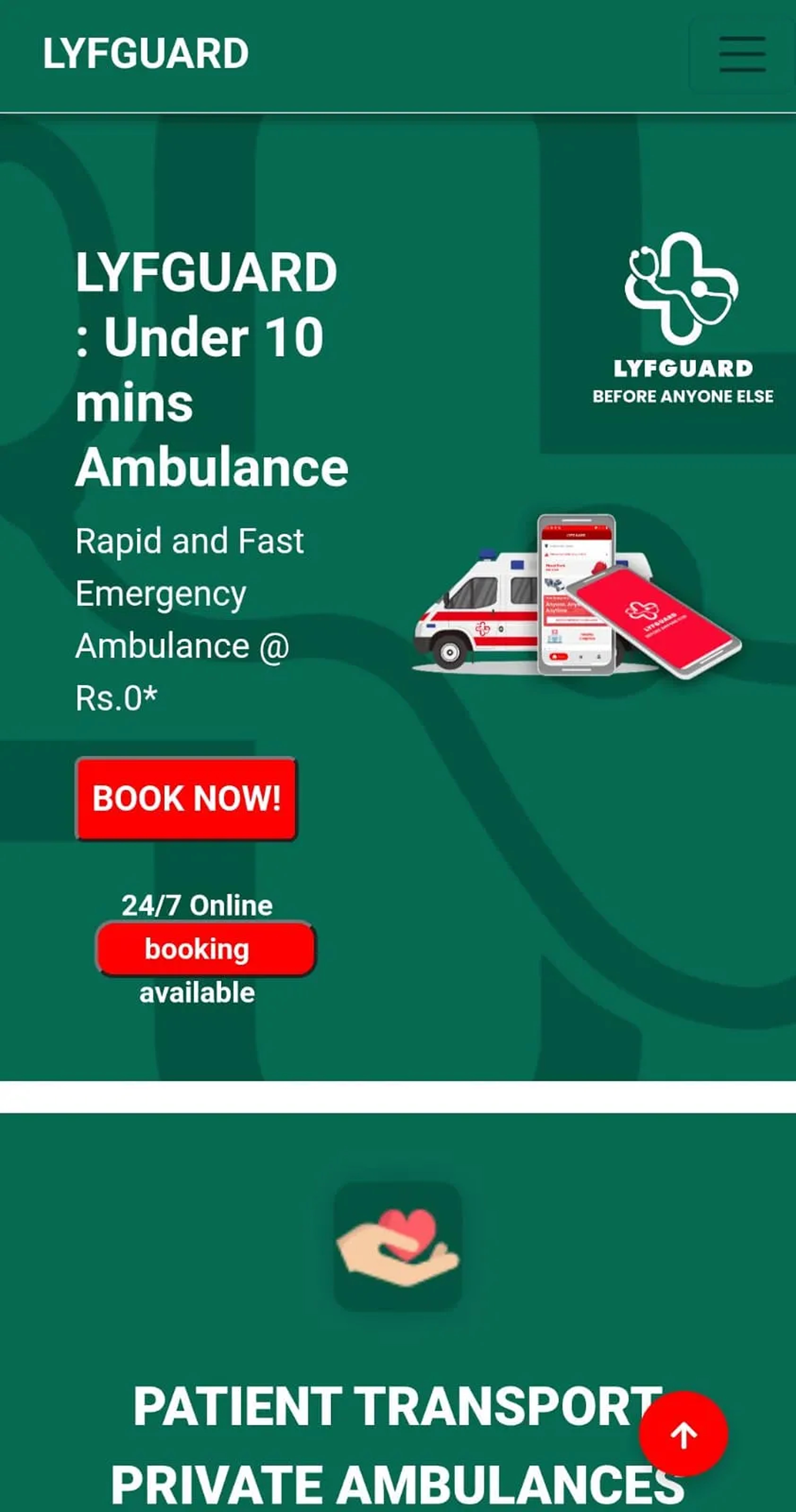
Version one was functional but created several friction points that slowed agents down and obscured critical information. Four core problems stood out:
No visual proof up top.
Just a wordmark and stacked headline text; nothing to confirm this is a real, working service at first glance.
Competing CTAs
"Download Now," "Book Now," and "24/7 booking" all styled as equal buttons, with no clear next step.
Core offer buried.
Secondary content (emergency contacts) appeared before the actual ambulance-booking flow.
Trust signals with no weight
Stats like "100% / 6 / 50+" had no icons, no context, no visual hierarchy easy to scroll past.
Nothing to build confidence.
No testimonials, no service breakdown, no way to feel this brand is credible before handing over an emergency.
03 — Before

Design Solution


☑️ Real ambulance photo + clear promise
☑️ 1 primary CTA, 1 secondary
☑️ Stats + real testimonial with rating
☑️ Clear 3-step process
☑️ Full service list + recruitment section
☑️ Core promise leads immediately
04 — Outcomes
The changes target four measurable agent behaviours: triage speed, delegation clarity, error reduction, and scalability with large task queues.
Usability
Reduced decision-making from 3 competing CTAs down to 1 clear primary action removes hesitation at the exact moment users need to act fastest
Sticky mobile CTA bar keeps "Call" and "Book Now" one tap away at any scroll depth, instead of forcing users back to the top
Trust & Credibility
Resolved the 24/7 vs. "10 AM–5 PM" contradiction; the single highest-risk trust issue on the page is gone
Real, distinct testimonials with working carousel controls replace a fake static "carousel"; what users see now matches what actually works
Consistent stat labeling and highlight logic makes the trust section read as intentional, not accidental
Clarity
Each "How it Works" step now has a distinct icon, so the process can be understood at a glance instead of requiring users to read every word
"Join Us" routes each audience (drivers, medical staff, partners) to its own clear next step, instead of one vague "Join Now"
Accessibility & Performance
Hero swapped from a busy background photo to a high-contrast dark background removes any risk of text failing WCAG contrast
Fully keyboard-navigable, visible focus states, and respects prefers-reduced-motion throughout
05 — What I Learned
Urgency-driven products need urgency-driven hierarchy; every extra decision on screen is a real cost when the user is stressed.
Trust is built with specifics, not adjectives. A real testimonial with a name and city did more work than any headline claiming reliability.
A single contradiction (24/7 vs. limited call hours) can undo more trust than five good design decisions can build back.
Content order is a design decision: moving the core offer above secondary features changed how the whole page reads.
Consistency compounds trust: matching CTA style, icons, and color logic across sections makes a page feel like one product, not stitched-together sections.