AccoutCare (B2B)
AccountCare is a centralized tool for Customer Success teams to manage accounts, track health, follow up on tasks, and drive retention.
Product Design
Project Overview
Client: DexKor, a seed-stage startup
Industry: Website Builder, Founder Tools
Timeline: 4 weeks (2025)
My Role: Product Designer
Users: Account Managers, CSMs
Product: Dexkor CX Suite
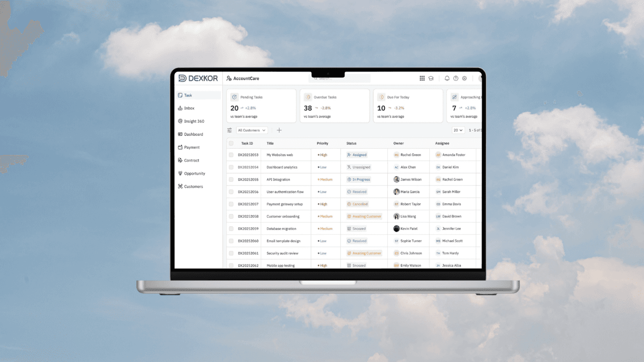
Transforming a bare-bones task list into a data-rich, decision-enabling workspace — giving account managers a real-time view of workload health before a single row is clicked.
01 — Context
Dexkor's CX Suite is a B2B customer experience platform. The Task module lives inside AccountCare the section of the platform used by Customer Success Managers and Account Managers to manage renewals, escalations, and ongoing account health.
02 — Problem
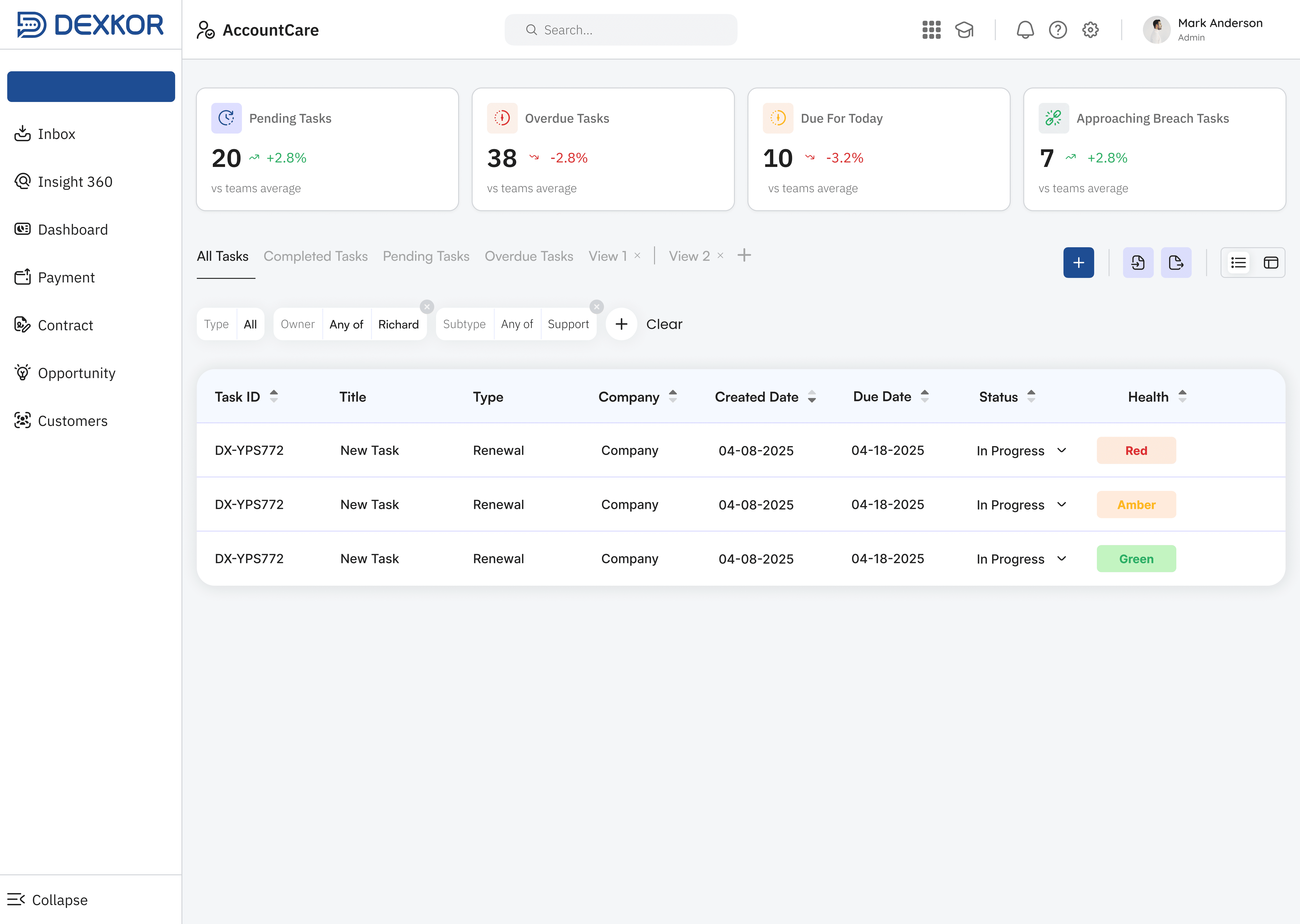
The version one task interface was a minimal list view. It showed rows of tasks but gave managers no high-level awareness of their workload health without scrolling and reading individual entries. Few distinct failure points were identified:
No workload summary
Managers had to count tasks mentally. There was no aggregate view of how many tasks were pending, overdue, or due today.
No priority signal
Every task looked the same in the list. High, Medium, and Low priority tasks had no visual differentiation only a "Health" column with a colour badge, used inconsistently.
Missing ownership data
The old table showed Company but not Owner or Assignee. Managers couldn't quickly see who was responsible for a task without opening it.
Sparse filtering and no pagination
The filter bar was minimal and manual. There was no row count, no page size control, and no view-toggle for different layouts.
03 — Before
Design Solution
Task Workspace
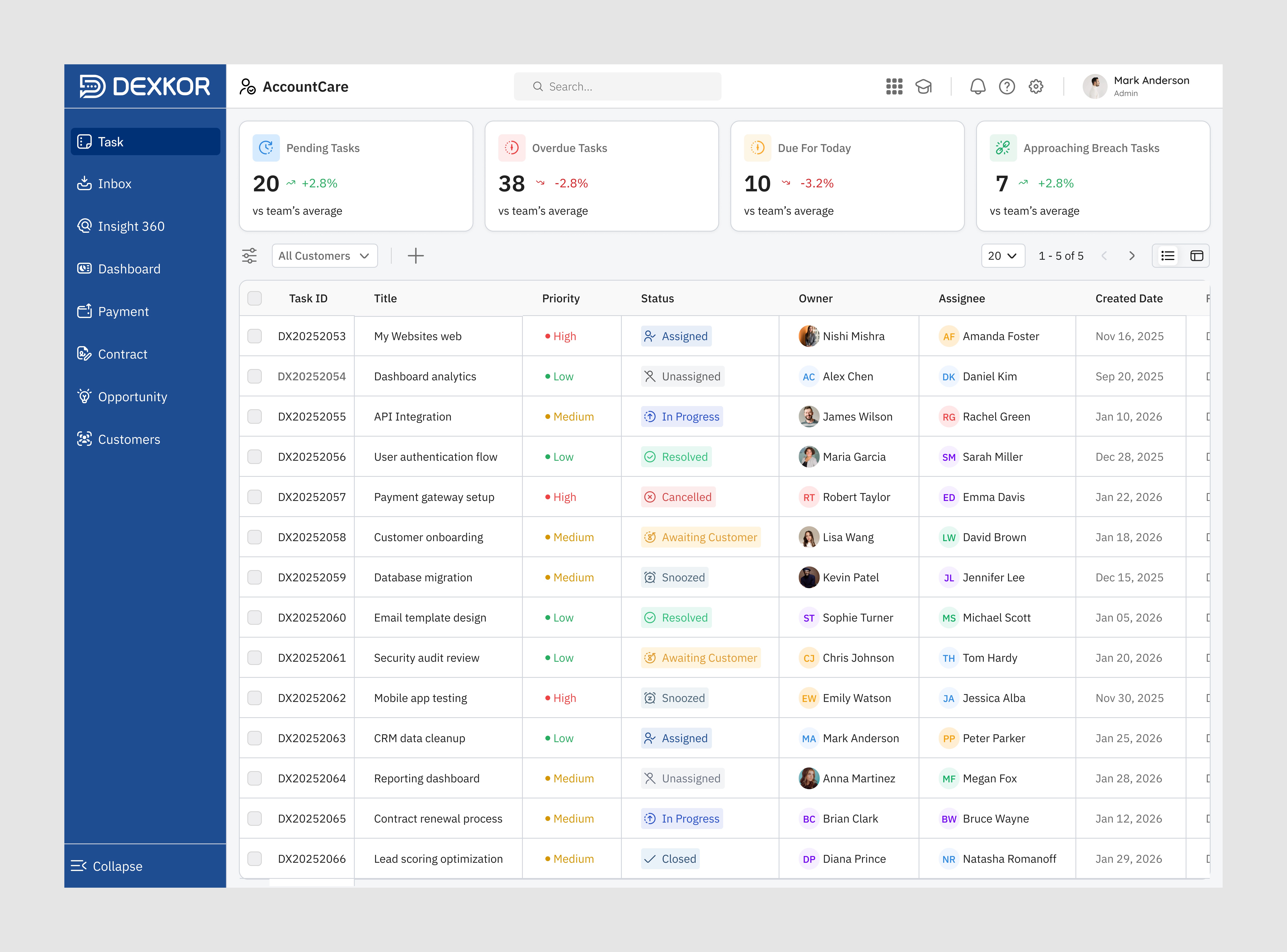
☑️ 4 summary cards: Pending, Overdue, Due Today, Approaching Breach — each with trend vs team average
☑️ Priority column with coloured dot: Red = High, Amber = Medium, Green = Low
☑️Owner shown as an avatar + name: Assignee with initials badge + name
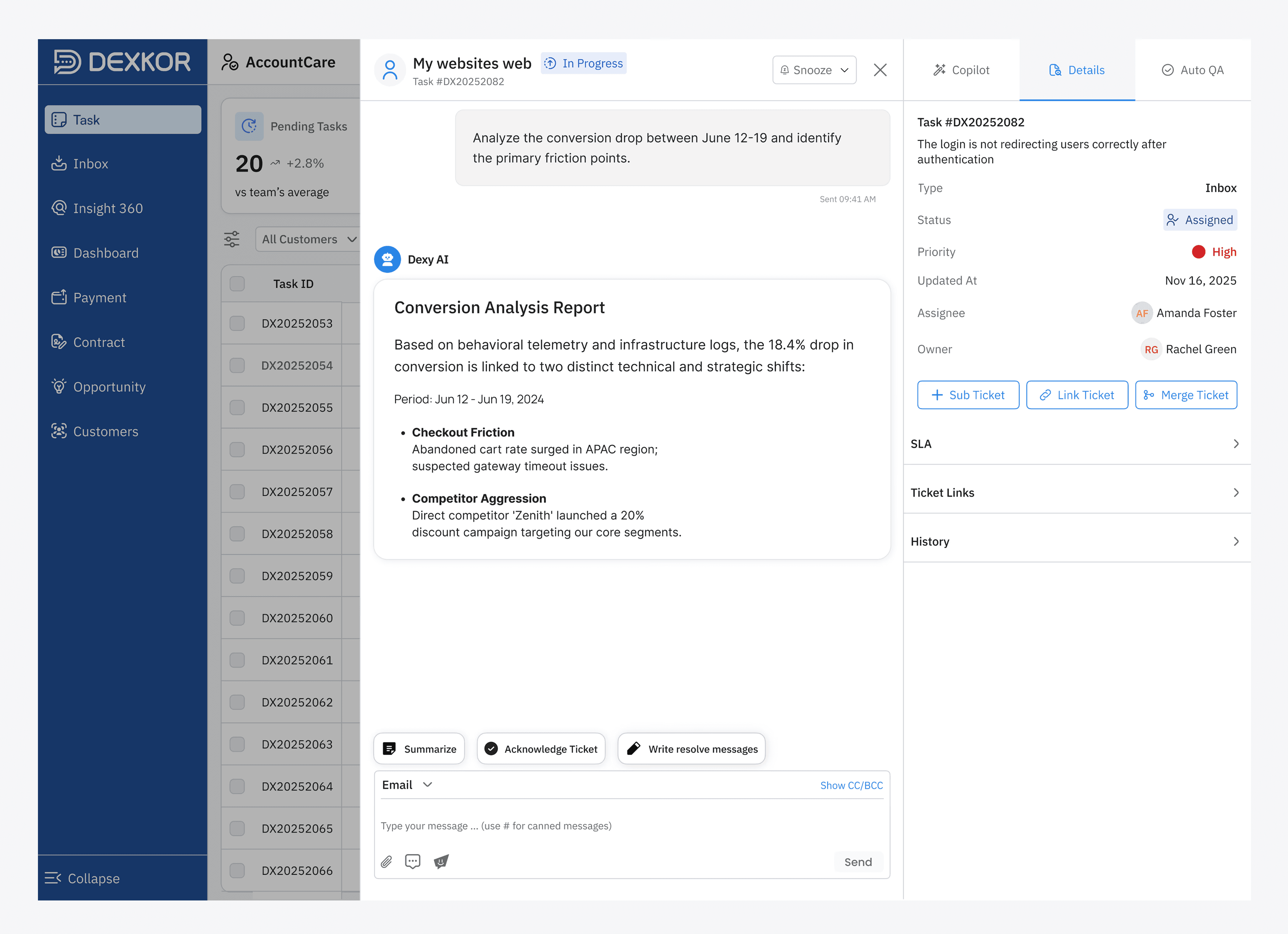
☑️ Status shown with icon + colour: Assigned, In Progress, Resolved, Snoozed, etc.
☑️ Composable filter bar: “All Customers" dropdown + add NEW TASK button
☑️ Pagination with row-count selector (20 per page, 1–5 of 5)
☑️ Row checkboxes for bulk selection and actions
04 — Before
The changes target four measurable agent behaviours: triage speed, delegation clarity, error reduction, and scalability with large task queues.
⚡ Faster triage
Managers had to count tasks mentally. There was no aggregate view of how many tasks were pending, overdue, or due today.
🎯 Clearer priority
Colour + text priority column removes urgency ambiguity
🤝 Better delegation
Owner / Assignee split shows who owns vs who executes
📉 Fewer errors
Rich status vocabulary reduces task misclassification
📦 Scales to 100+ tasks
Pagination + filters keep large queues manageable
🧭 Spatial clarity
Breadcrumb + labelled sidebar removes navigational confusion
05 — What I Learned
Designing for B2B SaaS requires balancing high data density with clarity.
Through this project, I learned how to:
Learned how enterprise SaaS users manage customers, tasks, and daily operations.
Shifted from designing screens to designing complete workflows.
Improved my product thinking by balancing business goals, user needs, and technical constraints.
Learned to reduce cognitive load through better information hierarchy and interaction design.
Gained experience collaborating closely with PMs and developers, using feedback to refine the product.