Helpdesk (B2B)
Evolving a support helpdesk chat into a focused, structured agent workspace — reducing cognitive load while surfacing the right context at the right moment.
Product Design

Project Overview
Client: DexKor, a seed-stage startup
Industry: SAAS · CRM
Timeline: 4 weeks (2025)
My Role: Product Designer
Module: Live Conversation View
Users: Account Managers, CSMs
Product: Dexkor CX Suite
Transforming a bare-bones task list into a data-rich, decision-enabling workspace — giving account managers a real-time view of workload health before a single row is clicked.
01 — Context
Dexkor is a B2B customer experience platform. The Convo module is the real-time conversation hub where support agents handle customer tickets across channels: email, chat, and more.
02 — Problem
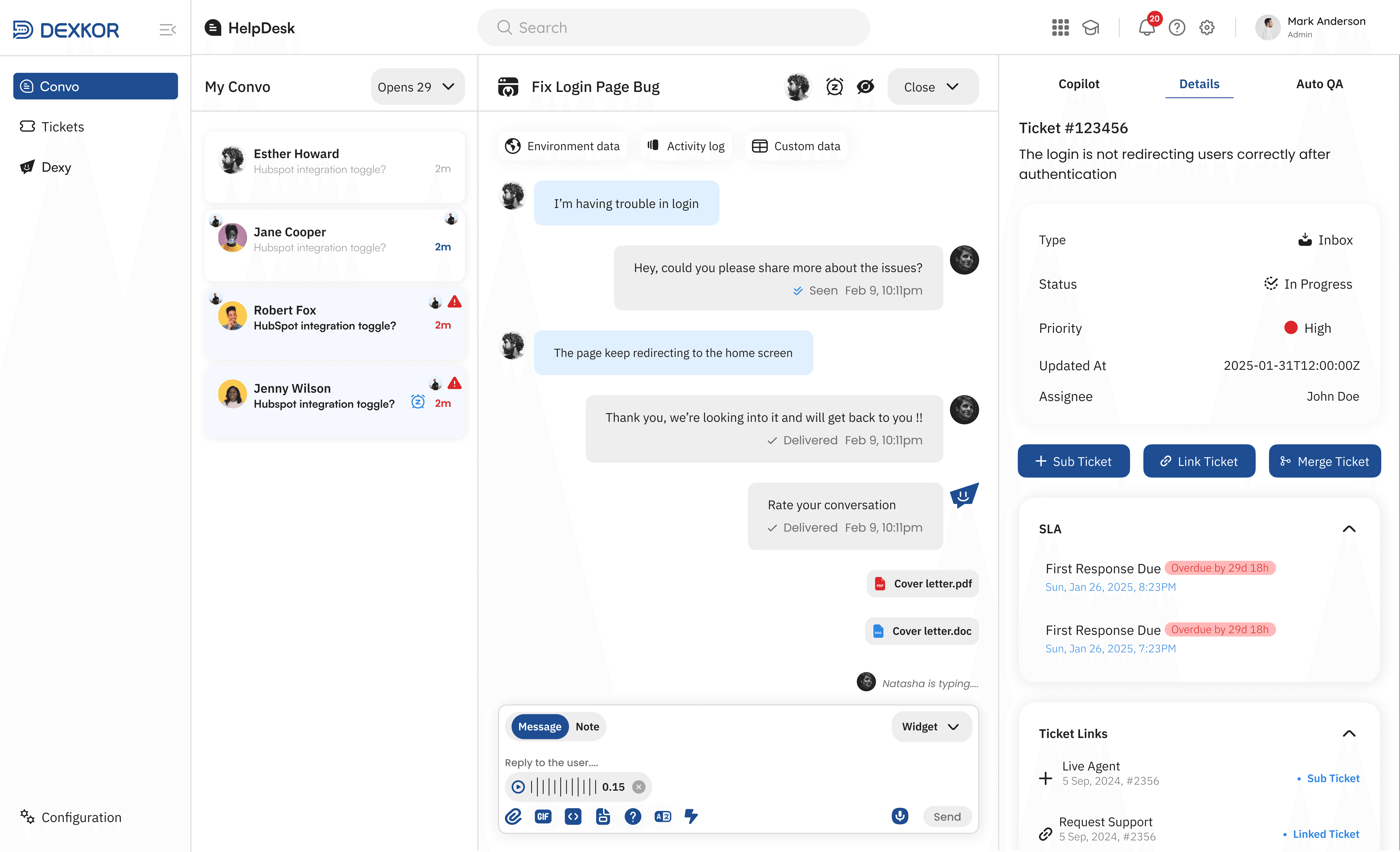
Version one was functional but created several friction points that slowed agents down and obscured critical information. Four core problems stood out:
Visual hierarchy breakdown
SLA timers, assignees, and status fields were buried in a right panel with no hierarchy agents had to hunt for the most important values.
Fragmented ticket metadata
Every task looked the same in the list. High, Medium, and Low priority tasks had no visual differentiation only a "Health" column with a colour badge, used inconsistently..
Navigation ambiguity
The sidebar navigation was unmarked icons without labels, no indication of the active section, and no product identity to anchor the experience.
Cluttered conversation toolbar
The reply area contained a text channel toggle, emoji bar, and action buttons all at similar visual weight. Easy to miss the Send button.
03 — Before
Design Solution
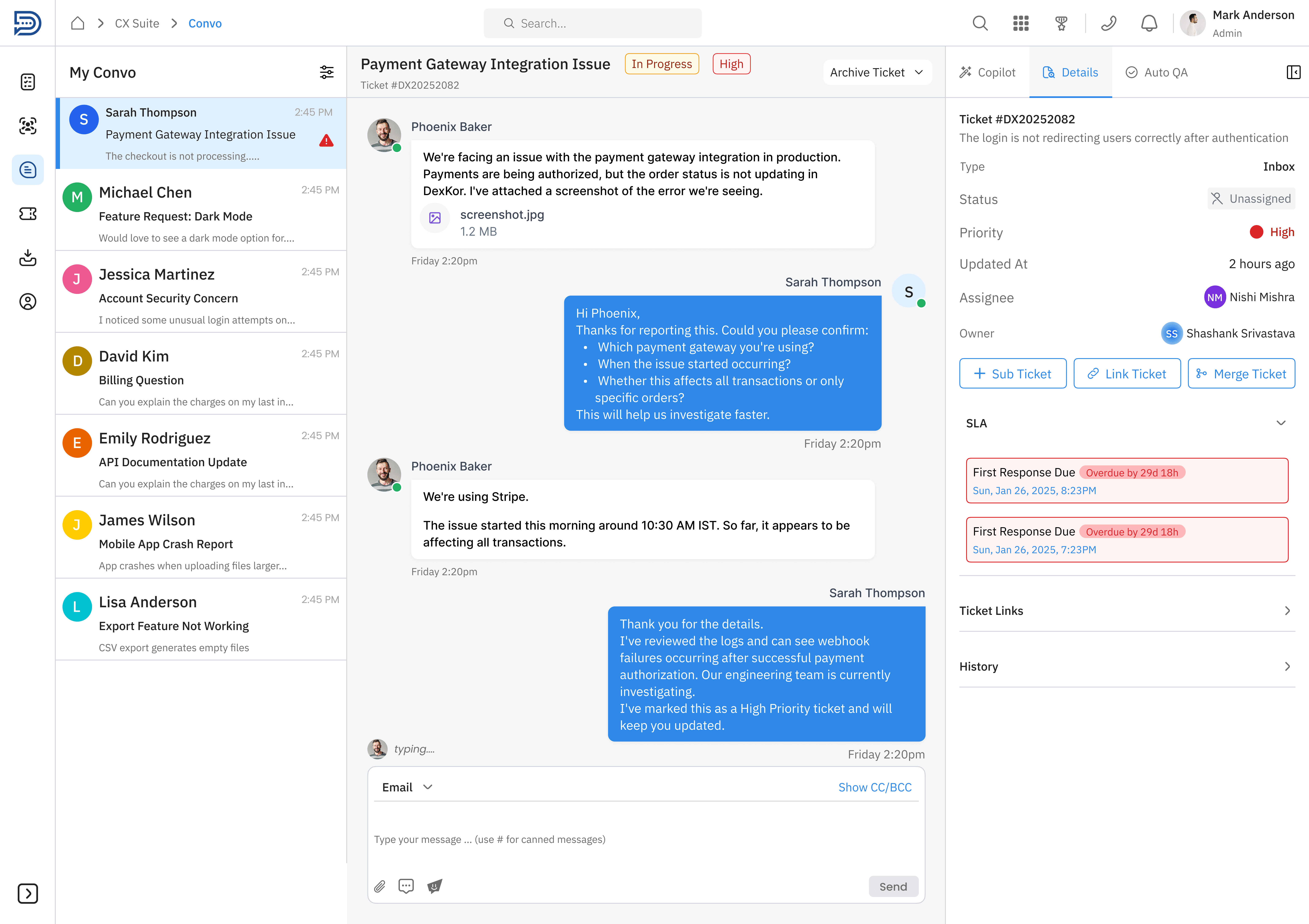
☑️ Sidebar has labels (Convo, Tickets, Dexy) with active highlight
☑️ Ticket list shows colour-coded priority badges + alert icons
☑️ SLA overdue alert surfaces immediately in the right panel
☑️ Reply area has clear Message / Note / Widget tabs + Send button.
☑️ Logged-in user identity in the top-right corner
☑️ In Progress + High badges on the ticket header
☑️ Context tabs promoted to the top of the conversation view
04 — Outcomes
The changes target four measurable agent behaviours: triage speed, delegation clarity, error reduction, and scalability with large task queues.
Faster triage
Priority signals visible before opening a ticket
SLA misses
Overdue banners surface before agents scroll
Better delegation
Owner / Assignee split shows who owns vs who executes
Mode errors
Clear Message vs Note tabs prevent reply mistakes
Nav friction
Labelled sidebar removes memorisation requirement
Spatial clarity
Breadcrumb + labelled sidebar removes navigational confusion
05 — What I Learned
Designing for B2B SaaS requires balancing high data density with clarity.
Through this project, I learned how to:
Understand the day-to-day workflows of support agents and customer success teams before designing.
Prioritize usability over visual aesthetics, especially for screens that users interact with throughout the day.
Design scalable solutions by considering edge cases, different ticket states, and large volumes of data.
Create clear information hierarchy so users can quickly identify priorities, statuses, and actions.
Balance business requirements with user needs by collaborating closely with product managers and developers.
Think beyond individual screens and design complete user journeys and interconnected product experiences.
Appreciate the importance of consistency through reusable components and design systems in enterprise products.